Today I thought I’d share this blog post from Stephanie Evergreen. She has a business (and a great blog) where she teaches people how to display information in meaningful ways.
This particular post is about short reports. We develop a lot of these at my workplace and we try to make them as interesting as possible, but I’m not sure that they always hit the mark.
Check out Stephanie’s advice and see what you think.
Many people think that simplicity and complexity are natural opposites, but nothing could be further from the truth. You can express very complex ideas in ways that most people can understand if you make your explanations clear enough. You don’t need to dumb down your ideas to make them understandable, you just need to present your ideas in a logical order that people can follow and use examples that people understand and are familiar with.
The opposite of simple is disorganised
When ideas are poorly organised, they look jumbled and confusing. Things can seem a lot more complicated than they really are. Think of a drawer full of stationery all mixed in together. It’s hard to know what’s in there, let alone find the pen you really need. It’s the same with ideas. When they are organised in a sensible way, people feel calmer and are able to absorb ideas more easily.
Use headings to get your ideas in the right order
Getting your ideas sorted into a sequence that makes sense is perhaps the hardest part of writing a document or developing a presentation, but it’s the most crucial step. I suggest drafting a high level plan before you start writing, so that you can get your ideas in order first. This will make the writing easier as you will already have your headings and you wont need to sit there thinking about what to write next.
Try it next time you embark on a new project and let me know how it goes.
Like many people, I am a bit of a sucker for reading ‘Instructions for life’. You know the kind of thing I am talking about. They usually include things like being kind to yourself, trying new things and being kind to others. The other day I read a list which included having some lemony water every morning before breakfast. I’m not sure exactly what that does to your body, but I’m guessing it wakes up your mouth.
Instructions are very appealing. Just being called ‘instructions’ gives them a level of importance and authority. They are much more impressive than mere suggestions . The underlying message is that you just need to do exactly as you are told and all will be well.
So I was quite puzzled by the instructions printed on a new garment I purchased today, which read “Think climate cold wash and line dry”. I misinterpreted this to mean that in a cold climate, one should wash and line dry the item, when of course it was actually an instruction to use cold water and a washing line instead of using hot water and a dryer.
I know that not many people would have misread this instruction, but it did make me laugh when I realised my mistake. I also know that a simple hyphen would probably have helped.
All of the people in my family are quite good at criticising other people, and that includes me.
It’s not our intention to be mean, we are just really good at noticing things. We’re especially good at pointing out spelling errors and the misuse of words.
The downside of this is that my comments can sound a bit harsh, especially when I am marking assignments or reviewing the design of a website which someone has been lovingly creating.
This happened to me at work last week. I was so busy giving the person good advice (to be fair, they did ask me for my honest feedback)that I forgot to be sensitive to the fact that few of us can really tolerate criticism unless it is delivered with gentleness.
I’m often asked to review or comment on other people’s work and I try to remember that my job is to help people improve their work, rather than leaving them feeling like it has been chopped to pieces. But sometimes I fail and I need to work on this.
So while designers need to know about typography, colours, fonts, visual hierarchy and plain English, they also need to be good communicators and that’s a skill that requires endless practice.
I’ve recently discovered that nearly everything I’m interested in can be captured under the title of ‘INFORMATION DESIGN’. Apparently this is now recognised as a field of knowledge in its own right.
Why is this exciting?
It’s a bit hard to explain. It’s the same feeling you get when you have a mystery ailment – an odd collection of symptoms that seem to have no connection – and you discover that this is actually has a name, for example, arachibutyrophobia (the fear of peanut butter sticking to the roof of your mouth). It’s oddly comforting to find that something has a name. It makes it more legitimate somehow.
Three reasons to celebrate
I like the fact that information design is a recognised field for three reasons:
I am interested in a lot of different areas and it pleases me that these are all connected and that I am not just finding it hard to concentrate.
It means that there are a number of good books on the topic that I can read and learn from.
It means that there are conferences and websites where people exchange ideas about this very interesting topic.
What do information designers do?
Information designers turn complicated concepts into things that are less confusing and easier to comprehend. They help people get things done. They design forms that people find easy to complete, they write clear instructions for new products, they help people find their way around shopping centres and universities.
They also design:
Websites
Maps
Reports
Slides
Signs
Packaging
Menus
Infographics
Why does it matter?
If you are trying to find out how your new coffee machine works and the instructions aren’t very clear, it’s hardly a life threatening situation, but it can be annoying. If you are trying to find the entrance to the emergency centre at your local hospital and the signs aren’t clear, it could actually be a matter of life and death. What both scenarios have in common is that they leave us feeling confused and anxious and we often blame ourselves for our failure to understand. We shouldn’t do this because more often than not, the problem is that the information itself is poorly designed.
People come first
Information design matters because it puts the focus on the people who are going to use the information, not on the information itself.
I think it’s a fascinating field and over the next few months I’m planning to learn as much as I can and extend my skills.
Apparently I confused more than one reader when the sign I discussed in my last post didn’t actually show up in the message. This is apparently a function of the blog software which I use so I have learnt something from that exercise.
Here is the photo of the speeding sign for those of you who missed it.
On our recent trip we were amused by this road sign exhorting us to drive as quickly as we could.
You sometimes wonder who on earth writes these signs and whether or not anyone actually reads them before they go on display. In this instance I think that most people would work out what the real message was, but sometimes poor signs can have disastrous consequences.
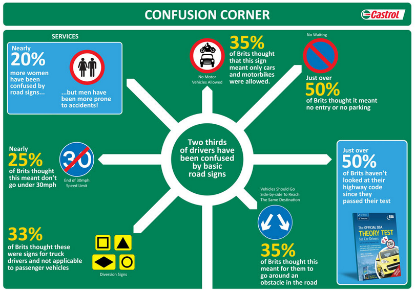
This infographic from the Guardian shows that many people in Britain are more than a little confused about what the various road safety signs actually mean, and I think this would be the case in most countries.
What makes a good sign?
As with most things, typography is important. The font used in all British road signs was developed specifically for that purpose and is designed to be legible at a distance. Not only does the type have to be very clear (no serifs or curly bits required thank you), but the spacing between the letters needs to be exactly right. Adjusting the spacing between the letters is called kerning.
Diagrams need to be as unambiguous as possible. If you are designing a sign or instructions of any kind you need to make sure that you test them out on as many people as possible to make sure that they are not misinterpreted. In your focus group you should include older and younger people and people from as wide a range of cultural backgrounds as possible.
Your sign needs to contain the minimum amount of information required to make it meaningful and the colours need to be chosen to allow for conditions such as colour-blindness.
I know that not all of you spend your days designing signage, but the same rules apply if you are making instructions for how to get to your house, or how to use the photocopying machine at work. These are not necessarily matters of life and death but people appreciate clarity and will be grateful if you make the effort.
Here is my favourite example of an hilarious sign…
The term ‘user-centred design’ is most commonly used in relation to web design, but I think it’s a concept that could be applied to every presentation that you make, and every document that you write.
In everyday use, user-centred design is about meeting the needs of users. This means designing a website that is easy to navigate and where you can actually find what you are looking for. Similarly, a product that is designed with the user in mind will have the following features:
The buttons (or controls) will be in a sensible place and be the right size for your fingers to operate
The operating instructions will be clear and logical
The product will do what you expect it to do
It will make you feel satisfied (maybe even happy) when you use it
In his book ‘The Design of Everyday Things‘, Donald Norman makes the point that designers need to understand how people think before they can design products that people will find useful. This means taking the time to think about their view of the world and their mental models of how things work.
Reports and presentations are no different.
They are often written from the point of view of the writer and are not really intended for the audience or the reader. Far too often, no context is provided, or alternatively a whole lot of irrelevant information is provided. The worst offenders are people who include their organisational charts in presentations.
English: Organisational chart produced by the Office of the High Commissioner for Human Rights, to describe the functioning of the United Nations system of human rights bodies. A form of public information material designed primarily to inform the public about United Nations activities (Photo credit: Wikipedia)
An organisational chart is rarely of interest to your audience, unless the people in the audience actually appear on the chart. For external audiences, please feel free to skip the org chart, in fact, feel free to leave out any information that is not actually of interest to your audience.
When you are writing or developing a document that is meant to be informative, have a big think about what would actually be of interest to your audience and include that. If you feel you must tell people about how your organisation works, make sure that you tell them why this might impact on them. For example, if you have a customer service officer in every office across the state, this could enable you to have a good understanding of local issues that might affect your customers.
Make sure your information is clear and that your points flow logically from one to another. I read a lot of reports which are okay as drafts, but the content really needs editing and re-arranging. I see a lot of presentations where the author has clearly had an information dump, straight from their brain into the slides. It would be much better to sit down with a piece of paper and work out what it is that your audience might want to know and start with that. People are generally interested in anything that impacts on their wealth, health and happiness, so that would be a good place to start.
If you design your information with the user in mind, you will have a satisfied and happy audience.
Try it and let me know how it works out. I’d love to hear from you.
I’m guessing that most of us have spent at least a little bit of time recently deciding what we will focus on, and what skills or interests we want to develop in 2013.
I don’t know about you, but one of my biggest problems is that I am interested in way too many things, to the point where I flit from topic to topic always hungry for new and interesting ideas but not really digesting or absorbing very much. And while this is very entertaining, it results in knowing a little bit about a lot of subjects, but not being an expert on anything in particular. This is not a good thing in the world of business (so they say), which favours those with marketable expertise.
So this year I am going to focus on being more focussed.
This means finishing one book before starting another. (Well maybe I can have one fiction and one non-fiction on the go, but not five at once).
Attention (Photo credit: aforgrave)
It also means spending more time writing about practical ways that you can craft your material so that your messages are clear.
This doesn’t mean that I’ll only talk about one thing. As far as I am concerned, there are many elements to clarity. Regardless of whether you are writing a report, creating a presentation or designing a website the principles and elements are the same.
You need:
Clear concise writing that makes sense to the reader
Consistent and logical ordering of your content
Plenty of white space so that your text is legible and doesn’t overwhelm people
Graphs, charts and illustrations that help people to understand your message
An understanding of how people learn and how they make sense of information
But above all, you need to KNOW what it is you are trying to say. Working this out is by far the most important thing you need to do and is the place where you should start.
So my plan for the coming year is to focus on writing helpful, inspiring and practical blog posts. What are you going to focus on? Are there skills that you want to develop and can I help you?
 Today I thought I’d share this blog post from Stephanie Evergreen. She has a business (and a great blog) where she teaches people how to display information in meaningful ways.