Skeuomorphism

There’s been a lot of debate in the design world lately about skeuomorphism. You may not be familiar with this term and I have to admit that it was new to me until a few months ago. By the way, it’s pronounced skyoo-a-morf and comes from the Greek words for tool and shape.

Basically, skeuomorphism is when some or all of the elements in a design look like the objects that they represent, rather than having a flat representational design. Skeuomorphic objects have digitally created textures (for example simulated woodgrain or leather stitching) that look just like the real thing.

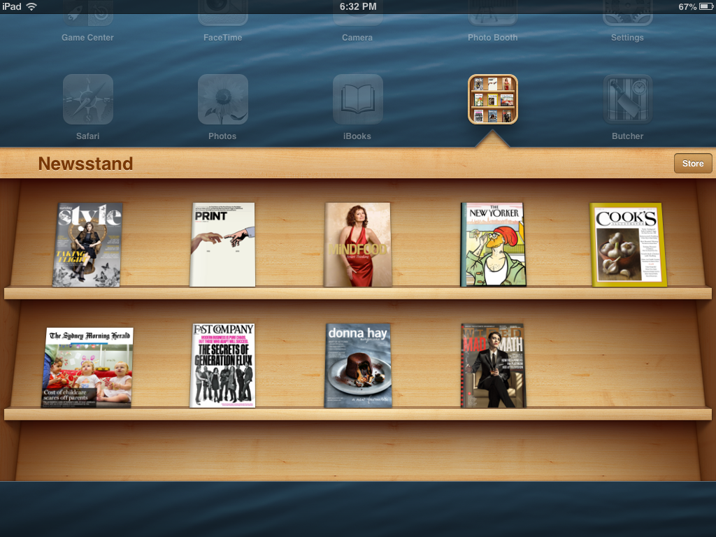
Probably the best way to explain this is by giving you some examples. The most obvious one that comes to mind is the classic iBook bookshelf.

skeuomorph
Classic example of a woodgrain texture
Skeuomorphic design
Just like the real thing.

Skeuomorphic designs are used used to give people the impression that the app or website is friendly and easy to use. Because we are familiar with the object being represented (we all know how buttons work after all),  we unconsciously believe that our interaction will be positive.

So why is there a debate?

Let’s start off by saying that in the design world  there are always debates between minimalists (people who like clean uncluttered design) and those who like more flourishes. I probably fall into the first category as I have quite a fondness for white space. Whilst I think that skeumorphic designs are friendly, (and very clever from a graphic design perspective), I don’t always find the apps on my iPad that easy to use and I often find this quite frustrating. It’s as if someone has put a lot of effort into making something look easy to use, but the reality is that sometimes it’s not really all that obvious how the darned thing works. It’s kind of like the app is saying ‘I’m so easy to use, any fool can work this out’ – except me, apparently. When I try and use an app with a lovely friendly interface, and I can’t figure out how it works, it’s somehow more frustrating than when I try to use an application that looks complicated.

Skeuomorphic design is definitely going out of favour in the graphic design world and flat design is coming back in, however it’s still really big in the e-learning world and it’s finding favour in presentation design lately. I’ve been seeing a fair few blackboards and corkboards popping up in presentations recently, so if you are looking for something to spice up your presentation you could have a play around with skeuomorphism. At least you’ll know how to pronounce it!


Enhanced by Zemanta

Learning by doing

I received an email from a chap who wanted to let me know that I had made quite a few typographic errors on this site, especially in my post on being creative . He said that the text ran awkwardly into the photo caption and he was right, it did look ugly. I’ve fixed it now, but in future I’ll be a lot more careful to check how the blog entries look on different browsers.

He made it pretty clear that I should not be giving people advice about graphic design when my blog contains so many obvious errors. As you can imagine I was a bit flattened by this and it took me a couple of days and some kind words from my husband before I cheered up again.

It did make me have a long hard look at what I am trying to do on this blog, so I thought I would share some of my thoughts with you…

As I have mentioned before, I started this blog primarily to practise my writing. It can be hard to find something to write about, so I decided to write about things that I’m interested in, these being design, visual communication and writing. I come from a family of grammar pedants and general nitpickers, so I really can’t help being interested in these things. Travel along a highway with any member of my family and you will hear a running commentary on why the roadside signs are unclear or confusing and how they could be improved.

So although I was criticised for being a student giving graphic design advice, I actually write about a whole range of topics and don’t consider myself an expert in the area of graphic design.

Graphic design is only one aspect of clear communication and is no more or less important than knowing what it is that you want to say, and being able to express that as clearly as possible. 

It’s true that I am enrolled in a graphic design course, but this is merely out of interest and not because I have any aspirations to become a graphic designer. I simply don’t have the talent. This doesn’t bother me.

Learning about graphic design helps me do my job better, as does reading about how we absorb information and make sense of the world.

I am very much a learner sharing my learning journey with the world. I’m a staunch advocate of learning by doing, so this naturally means that I’ll be making plenty of mistakes along the way.

I also love to teach and this means that I want to share ideas, insights and information with people like you. My hope is that you will find the content useful and interesting (at least some of the time).

I appreciate that publishing my ideas and opinions leaves me open to criticism and that’s okay. Receiving feedback is just part of the learning process and I really do welcome any comments or questions you have, good or bad.

Enhanced by Zemanta

Not really that creative


HB graphite pencils Deutsch: Bleistifte der St...
HB graphite pencils Deutsch: Bleistifte der Stärke HB (Photo credit: Wikipedia)


When I am delivering my presentation design course a lot of people tell me that they would love to develop their design skills but that they are ‘not really that creative’. As I have mentioned before, I find this quite amusing as I am not really that creative myself. Some people are born with flair, but most of us have to work at developing their design skills. It certainly doesn’t come naturally to me.


About eighteen months ago I enrolled in a Bachelor of Graphic Design course so that I could develop my design skills. Since then I have struggled through the course, one subject at a time, and I must say it’s not talent or good results that makes me continue, just dogged perseverance and an unwillingness to give up or give in. I’m not sure if I am improving or becoming more creative, but I am learning a lot and I think that putting the principles into practice must surely pay off in the long run. At the rate I’m going, I’ll be studying for the next ten years or until I think I have a good enough grasp on the subject matter to forge ahead under my own steam.


What I have noticed since I started the course is that I’m a lot more tuned in to design. I notice colours and patterns. I appreciate beautiful packaging, I admire wine labels and linger over well designed websites. I see a lot more beauty around me and I think that’s a good thing.


I think one of the tricks to being creative is to develop an appreciation of what works and to be able to articulate why something works, rather than just liking it. My design course has helped me do that by introducing me to the rules and principles of the craft. Writing this blog has also provided me with the opportunity to share some of the things I’m learning about.


I would be very interested to know what you think about creativity. Do you have any thoughts on this topic or are there any topics that you think I should be writing about? I’d love to hear from you.