Seeing your work in action

Today I had the pleasure of watching some of my presentations being delivered to a small but interested audience. I mainly develop presentations for other people to deliver so this wasn’t unusual, but it has been ages since I had the chance to see them being delivered to a real live audience by presenters with a range of skills and experience. Some of the presenters followed the scripts (in the notes field) word for word and others just took the main points from the slide and then embellished this with their own anecdotes and examples. Both approaches seem to work equally well and depended largely on how experienced the presenter was and how nervous they were.

It’s interesting to see and hear how people interpret what you have developed, and it’s a great test of the clarity of your work. It’s all very well for something to make sense in your own mind, but sometimes things get lost in translation. I am very glad to say that this didn’t happen today. Everything made perfect sense (to me anyway). Of course it helps if you can spend some time before the event briefing the presenter about what the key ideas are and luckily we had had the chance to that. Talking someone through a presentation slide by slide is a great way to ensure that the presenter knows your intent and gives them an opportunity to ask questions and get the timing right. It also prevents that awful situation where the presenter peers blindly at the screen, hoping to discover what point they are supposed to be making.

I don’t want to sound too boastful, but the slides looked great, even from the back of the room. I also watched some presentations that had been developed by other people in my team and these were even better. This was very exciting for me because we’ve all been working hard on developing our design skills and its really paying off.

It was a very different situation when I started with this team just three years ago. I remember the slides being heavy with text, big on jargon and technical terms and featuring no visuals (barring some inappropriate and irrelevant clip art). There were dry, boring and uninspiring to say the least. Now they are clear, to the point and interesting. They contain lots of photos and diagrams, all of which you can see from the back of the room. It proved to me that even if you work in a technical field (as I do) and you have to make presentations about topics which are important (but not always that interesting), you can really improve your presentations. We have, and I’m sure you can too.

Next week I’ll talk some more about where to start, but in the meantime it would be great if you could tell me what your biggest challenge is when you are designing presentations? I’d love to hear from you so be brave and post a comment or question.

The ambiguity of signs

Quick, where is the loo?

Last week I had dinner at the RSL club with my 90 year old father-in-law and during the meal he asked what the green ‘running man’ sign meant. I said it was an exit sign and asked him what he thought it meant. He replied that he thought it might be a sign indicating that there was a toilet nearby. When I asked why the man was running, he said “he might be in a hurry to get to the toilet”. This exchange was followed by a lively discussion on whether signs are actually as clear as we assume them to be. Does the green running man really indicate that there’s an exit, or is he just a man in a hurry?

 I noticed that the word EXIT was on another sign, some distance away from the running man, however there was nothing to indicate that there was any relationship between them. In other words, proximity really does matter. If words and pictures are a long way apart we assume that they are not related concepts. Of course, the addition of the word EXIT on or near the sign doesn’t help people who can’t read very well or don’t speak English.

 According to Wikipedia (always a reliable source!), the ‘running man’ pictogram was designed by Yukio Ota in 1982 and is used in Japan, South Korea, China, Thailand, Australia, New Zealand, the UK and Norway. So the green running man is very widely used across a range of cultures, but is it clear?

 Can you think of a better way to indicate an exit using only visuals?

Basic Principles USING IMAGES

Many people like to include images in their presentations but struggle with choosing appropriate pictures. You need to think carefully about the message you are trying to convey to your audience and choose images that are interesting but not too clichéd.  I once made a presentation about productivity and included a picture of some rabbits. This went down well with most of the audience, but a couple of people looked slightly confused.

There are a few basic principles about using images I’d like to share with you:

  1. Always use high quality images – this means no cheesy clip art.
  2. Use relevant visuals and try to avoid decorating your slides. This isn’t a definite no-no, as sometimes a few pictures can provide a bit of interest and break up the text, but it’s better if you can use images that reinforce your content.
  3. Don’t squeeze or stretch your images. If you need to re-size your images, always hold down the SHIFT key and adjust the size from the corners. This will ensure that the height and width ratios are maintained.
  4. Don’t steal images from the web. You should use licensed or free high quality images. There are lots of places to get these at a reasonable cost. Just search for ‘free photos’ or check out some photo libraries such as Shutterstock http://www.shutterstock.com/ Alternatively, you can shoot your own images on a good digital camera. I’ll  talk more about this in future posts.

Do you have any other tips for using images in presentations?

I’d love to hear from you.

Basic Principles TYPOGRAPHY

There’s a lot I could say about typography (just ask my family!) but let’s start with some basics.

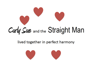
First of all typefaces have personalities of their own. Plain typefaces send the message that they mean business because they are no-nonsense in their look and feel. Curly fonts tend to be whimsical and romantic. These are the ones you usually see on wedding invitations and personal emails.

Type must be appropriate for the topic, be sympathetic to any images nearby and be suitable for the intended reader. Until recently, there was a view that sans serif fonts – those without pointy ends, such as Arial – were easier to read than serif fonts. Whilst this might be true as a general rule, some recent research suggests that the typefaces we find the easiest to read are those that we grew up with. In other words, the fonts that were in use when we were learning to read, remain the easiest for us to read. Type faces reflect social conditions and go in and out of fashion, just like wedge heels.

You’ll notice that I’m using the terms font and typeface interchangeably here. They aren’t actually the same thing, but the explanation is rather long and tedious so I’m not going to go into that now. Suffice to say that you need to choose your typefaces carefully. Don’t write a board report in comic sans, it just doesn’t send the right message about you or your topic.

You’ll be seeing more about typography in future posts, so stay tuned.

Love Story

Basic Principles WHITE SPACE

White space is also called neutral space and is considered to be as important as the words, pictures and objects it surrounds. It doesn’t necessarily need to be white.

Neutral space helps us make sense of what we are looking at. Imagine going into a room and seeing every wall covered with information, photos and messages. You would probably feel a bit overwhelmed. Your eyes would need to scan back and forth while you try and make sense of all the data and work out what the most important information is.

Way back in the 1950s there was a whole movement of type designers who thought that simple, uncluttered lettering was preferable to the ornate curliness of the 1920s and 30s. This was known as the Swiss Style and is typified by a very clean and uncluttered look. The catch phrase of the time was ‘less is more’.

Critics of this approach subsequently stated that ‘less was a bore’.

Less is more

So how do you achieve simplicity without oversimplifying your ideas?

Any ideas?

Basic Principles BALANCE

Balance is a delicate and natural thing. It can be symmetrical (even on both sides like a butterfly’s wings) or asymmetrical (uneven on each side, but still feeling balanced). There are many examples of balance in nature and I think balance is quite personal. When the balance is right, it just feels right. When it’s wrong, it feels uncomfortable. Off kilter is the way I would describe it.

Balance can be achieved using colour, weight – that is, areas of lightness and darkness – and different textures. The best way for me to explain balance is to ask you to think about serving up a beautiful meal. What are the proportions of the components of your meal? Are there a variety of foods and do they complement one another? Are there a range of textures and tastes, sweet and salty, crunchy and smooth? Is the total effect pleasing and soothing? Is there just the right amount of everything on the plate?

If you are trying to achieve balance, be it in your life or on the page, you need to pay attention to what feels right and trust your instincts.

Basic Principles CONTRAST

Contrast is what makes your design interesting.
There are lots of ways to achieve contrast in your work. You can use different shapes and sizes, light and dark or big and small. As well as providing interest, contrast provides emphasis. For example, a splash of colour will attract interest but can also be a way of highlighting an important fact or issue.
If you want to be noticed, you have to stand out in the crowd and be different from the rest. The single black sheep is always more interesting than an entire flock of white sheep.

Basic Principles PROXIMITY

Proximity is about how near or far objects are from one another.

Our brains make a lot of assumptions for us based on where things are located in relation to one another. People assume that there is a relationship between things that are together, even if there isn’t.  We just assume that things that are close together, belong together. Think of salt and pepper shakers, or two friends meeting in the park. When we see a couple with their heads close together, deep in conversation, we know that they are  ‘a couple’ and not just friends. When you are designing documents or slides, always put related information together so that people can easily see that it’s related. It’s equally important to use lots of white space to separate information that’s not related.

This seems really obvious, but its a design principle that is often neglected.

Let’s get started…

So here we are at the first post. As I said in the introduction, learning about design involves thinking, observing and just having a play around with ideas.

The first idea to ponder is what is ‘good’ design and why is it important? I strongly believe that everyone has a little bit of a design mind and that’s why we like gardening, cooking, art and maybe even having a tidy desk. In my book, good design is a combination of functionality and beauty. In other words, well designed things are both useful and attractive. I’ll have a lot more to say later about why it matters that things are attractive and why it doesn’t have much to do with decoration, but that’s a conversation for another session. If you are interested in the connection between functionality and beauty you should read Donald Norman’s book on why we like things to look nice.

What do you need to do?

Start by carefully observing the world around you. Do you have favourite objects, tools or websites? What makes them useful? Name three things that are well designed and say what’s good about them. You can post examples here if you would like to.

Then find three things that are badly designed – post some examples as well. Alternatively, get yourself a work book and write down your thoughts, ideas and examples.

Is this an example of good design?