What’s wrong with using curly fonts?

Trebuchet MS

I always encourage people to use plain fonts in their presentations. Curly (or serif) fonts are beautiful and I love them when they are used in the right place, for example for signage or on wedding invitations, but they are not necessarily suitable for everyday use.

The reason that we mainly use plain (sans serif) fonts in presentations is because they are more readable. Readability is about how distracted you are by the characteristics of the typeface. So when the ‘g’ has a lovely curly tail this can distract our brains from the message contained in the text. Anything that makes the typeface more interesting, such as thick and thin strokes, very tall letterforms or short stubby ones can distract us from the message and in some situations, its important that we get the message very quickly. You never see serif fonts used in road signs, for example.


Strictly speaking, readability is about how easy it is to read long sections of text (otherwise known as body text). So it would be OK to use a more decorative font for a headline or as a special effect, but keep in mind that every element of your slide should be there for a reason and this includes fancy fonts.


So what typefaces would I recommend? My personal favourite is Calibri, but any nice plain font such as Helvetica or Futura will do.


Fresh new look

One of the rules of blogging (apparently) is that you should maintain your branding so that people recognise your brand instantly. That means keeping the look and feel the same as well as keeping your tone of voice consistent. However, I’m not very good at keeping to the rules and I was feeling a bit glum so I thought why not have a whole fresh look? Also, I’m not a brand, I’m a person, so there you go. What do you think? Do you like the new look? Does it confuse or amuse?

In praise of stick men

Foto de Larry
Foto de Larry (Photo credit: Wikipedia)

Lots of people think that they aren’t creative. I used to think this myself, despite having worked in a number of jobs that require some degree of creativity, including working as a film editor, writer and teacher. Nevertheless it took me quite a long while to realise that when I said I wasn’t creative, I really meant that I couldn’t draw.

Whilst I would love to be able to draw, I have come to understand that if you are trying to explain something complex, stick men are not only perfectly adequate, they are actually preferable. Stick men, which even I can draw reasonably well, can convey information very clearly because they don’t come with the visual distractions that accompany a photo or a drawing of a real person. When we look at photos our brains are distracted by the extra information that we are asked to process. How old is that woman, what colour are her eyes, is she happy or sad, does she look like someone I know? These are only a few of the thoughts and ideas that flow through minds in the first few milliseconds when we see an image. The same goes for an illustration, especially if it’s well executed and life-like.

Not only do we get the message really quickly from a stick man (or a stick woman for that matter), a stick man can also convey movement (for example running) with little of no effort on our part.

So don’t fret if you can’t draw. You only need the most basic skills to depict relationships, instructions and behaviours. Go ahead and practice your stick men. Your audience will understand that you are merely illustrating a concept, and not trying to be an artist. And if you figure out a way to draw a stick woman (without be rude), let me know.

The truth about learning styles

Let me say straight up that I’m not a big fan of learning styles. You know, that’s where we do a little test to see if we are kinaesthetic, visual or auditory learners. I think that unless you have a disability and are limited in the use of one of your senses, then you are highly likely to learn using all of your senses. I have never met anyone who didn’t gain value from putting a set of ideas into practice (kinaesthetic learning) even if this is just by way of a scenario or a case study. It’s obviously not a good idea to practice your brain surgery skills on a real live person!

I think it’s more realistic to say that we all have preferences in the way we absorb information and this relates more to quantity and timing, rather than to learning styles. Some people really like lots of detail early on in the piece and other people (like me) much prefer to get an understanding of the big picture before they get into the nitty gritty details. I like to see the long term prospects of an idea and find details boring if they are provided to early in the piece. Other people like to know the ‘how, why and where’ right up front and can find it frustrating when people like me talk in broad generalities about why something is a good idea.

Not only can these two types of people drive one another crazy, it can lead to differences in opinion about the level of detail required in a document or a presentation. Have you ever written something lovely and detailed, only to have it come back with a request to cut half of the content? One of the main reasons that people put too much information on their slides is that they are ‘detail people’ and they think that everyone else wants to know every little detail about the project/plan/product. This doesn’t mean that big picture people are shallow or that detail people are pernickety fuss pots. It just means that we have to strike a balance without cluttering up the slides or ending up with a 40 page document when a 10 page document will do the job.

How can you work around this?

As a whole picture person, I am inclined to develop minimalist slides covering broad concepts. I have to constantly remind myself that some people like details but I really hate cluttering up my slides with text. On the flip side I know that everyone benefits from examples, so what I try to do is support my claim with evidence. This is known in presentation world as the ‘assertion- evidence’ method.

It works like this:

1. Make your claim in a clear simple statement. This can be in a complete sentence, for example “people are more likely to live longer if they get adequate amounts of sleep”.

2. You can support this claim in a number of ways. You don’t have to use statistics, although this is definitely one way of doing it. Other types of support can be images, anecdotes, charts and info-graphics. Remember that supporting the emotion behind an idea can help people absorb the message, so this counts as a type of support even though it’s not really evidence in the traditional sense.

Here’s an example of using an image to support an idea.

Assertion evidence method

Another suggestion is to let your audience know where they can find additional information. This includes providing links to websites, research reports and other supporting documents. Some people like to know the details and you have to satisfy their needs. What you shouldn’t do is clutter up your document or presentation with extraneous information. Remember simple is smart, you can do it!

Do you see what I see?

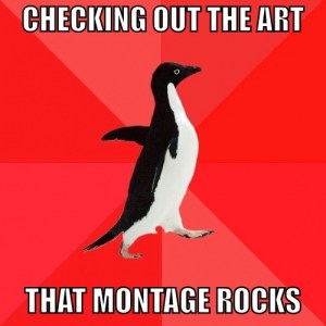
It’s been great to see how different people have responded to the penguins in the art gallery image. I even received this lovely artwork designed by Tom, emailed by Emma. Thanks for sharing Emma!

perceptual bias

It’s made me think deeply about the fact that we can never really tell how another person is ‘reading’ an image because our views are always distorted by our own perceptual bias. In other words, we all view the world through a lens made up of our experiences in the world. As Anais Nin said so eloquently…

“We don’t see things as they are. We see them as we are”.

I have been reading a book by Ken Robinson called ‘The element: how finding your passion changes everything’ and in it he talks about the impact of our cultural background on how we view the world. A number of studies have found that people raised in Western societies have a very different way of reading images to people from Asian communities where there is more of an emphasis on the community. When shown an image of a tiger in the jungle, people raised in Western cultures are likely to describe the image as being of ‘a tiger’. People raised in cultures where there are strong family and community ties are much more likely to say that the image depicts ‘a jungle with a tiger in it,’ or ‘a tiger in a jungle’.

What does this mean for people like us who are striving for simplicity and clarity? First of all we have to examine our own perceptual biases. Obviously we shouldn’t do this to the point of paralysis. If we stop too long to think about all the ways something can possibly be interpreted then we might end up doing nothing at all. But it is a good idea to be mindful of difference and to be open to other people’s interpretation of what we present. This means that when you are running your slides past a colleague and they completely misread the point you are making, you need to stop and listen and explore how and why they are interpreting your information the way they are. There’s every chance that they will bring a fresh new interpretation to your work.

This is what your comments have done for me and I’m really grateful. Thanks.


What does this image mean to you?

I have just finished doing an assignment on digital imaging where I had to produce a photomontage with a ‘message’. 

The instructions were to create an image which would make a strong visual statement about an issue, for example a political or social issue. This was difficult for me, not because I don’t feel strongly about a lot of things (because I do), but because it’s really hard to visualize some concepts, especially when you’re a bit hazy about your message.

The other criteria was that we could only use the photographs of certain (famous) photographers, so finding suitable source photos entailed hours of trawling the internet in a search for images which would inspire me. When I tried to rope in some friends and relatives to help me with my assignment, they all seemed to think that it would be a much easier task if I just knew what it was that I wanted to say. As a person who advocates for people to know what it is that they are trying to say before they start writing or creating presentations it struck me as hilariously funny that I had clearly failed to take my own advice. There was no way that I could find images that suited my theme when I didn’t have a clear idea of what it was I was trying to say.

I tried to get away with making some vague statements about the way the privileged classes monopolise culture, but it was hard to disguise the fact that I was just plain confused. I also tried to suggest that the finished image would express my idea better than any words ever could. Does an artist need to be able articulate the ideas behind their art? Shouldn’t the work speak for itself? Another ploy was to suggest that the viewer should be able to ‘read’ the image in any way they chose. Clearly, I was desperate and the due date was looming ever closer.

In the end I came up with the image below. It’s called ‘A visit to the gallery’.

What, if anything, does it mean to you? I would love to know if it says anything at all, or if you also struggle with pinning down your ideas?

How to write like a journalist

Most of us have a tendency to warm to our theme as we write. We usually start off with a few introductory sentences (like this) in which we explain why it is that we are writing about this particular topic, and what you might gain from reading what we have written.

A typical workplace report has an introduction that lets you know who the report is for and what it will cover. It often has an executive summary so that the busy executive doesn’t have to read through the whole document. (I often wonder why I should bother writing the rest of the report. I could be writing any old rubbish and be fairly confident that only the most persistent readers will make it to the end).

This is not necessarily the best way to write. Next time you have to write a report or a presentation, I suggest you try using the pyramid writing style.

Pyramid writing involves putting your essential message first and is the opposite of traditional writing. Most people are busy and will decide in the first few sentences whether or not they can be bothered to keep reading what you have written. This paragraph would be first if I were using the pyramid writing style.

The best part is that you don’t need to leave any information out; you just put it in a different order:

  1. Essential message first
  2. Supporting information
  3. History (or background) if needed.

This will keep all your readers happy because they can read the beginning to get the message, or the whole thing to get all the details.  It will also force you to know what your main point is before you start writing. This is of course how journalists write all the time. You might think it encourages laziness, but once you have engaged your readers with your key message, they are more likely to be interested in the supporting information.

Why not try this next time you are asked to write a report, an email or a presentation?

How to write like a journalist

Three tips for clear writing

I don’t really like the term plain English. It reminds me of a plain girl or a plain biscuit, a bit dull and unimaginative and slightly boring. Clear writing on the other hand, can be descriptive, even whimsical but it must be understandable (and therefore clear).

The need to write clearly is more than just a hobbyhorse of mine. I think that we have a responsibility to write as clearly as we can. As Tim Phillips says in his book, Talk Normal.

‘If you’re in government, isn’t it your responsibility to make your language accessible to all the people who need to understand you?’
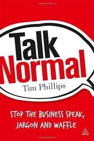
http://talknormal.co.uk/the-book/

Yes, yes and yes!

It just so happens that I do work for a government organisation and I agree 100% with this sentiment, however it can be hard to write clearly, especially about complex or serious topics.

It’s easy enough to write something simple and engaging about a new product or service – all you really need to do is write about what it can do to make your life better. Explaining the intricacies of a piece of legislation or writing a paper about a complex policy issue is much more difficult. This is where all the big words come into their own don’t they?

My friend Megan says that there are expensive words ($5000) and cheap words ($500) and that you should use the $500 words as much as possible. These are words that are short and to the point. These are not weasel words*. You should only use a $5000 word when no other word accurately conveys the point you are making.

But, I hear you cry… this is easy to say and hard to do. Well, yes and no. Here are a few pointers for you to think about when you are writing.

1. BE CLEAR ABOUT YOUR MESSAGE

One of the easiest ways to improve your writing is to be clear in your own mind about what you are trying to say. By this I mean that you should know exactly what the point is that you are trying to make and not be afraid to express it as simply and clearly as possible. I read a lot of documents where people just ramble on. It’s pretty obvious that they are trying to work out what their point as they write.

This doesn’t mean that you shouldn’t put your thoughts on paper in order to find out what you really think; it just means that all those words don’t necessarily need to end up in the final version.

2. VARY YOUR SENTENCE LENGTH

Secondly, you should try to vary your sentence length. It makes your writing easier to read if you use both long and short sentences. A lot of writing is unclear because the sentences run on and on forever. Keep some of them short. Yes, really short.

You should try to keep to one idea per sentence. Long dense sentences always lead to fuzzy writing.

3. THINK ABOUT YOUR READER

Thirdly, always think about your audience. Do they know what that acronym stands for? It can be terribly confusing for people when you use terms they aren’t familiar with. Don’t try to impress people with your intelligence by using language they don’t understand. Of course if you are writing for an audience of technical experts, feel free to talk the talk. They won’t mind. Just be very careful that you don’t alienate your readers by using jargon.

Are there any writing problems that you face that you would like to discuss? For example, do you need to give other people feedback on their writing and don’t know how to go about this?

I’d love to hear from you.

An image to illustrate weasel words on Wikiped...

* ‘Weasel words’ is the title of a book by Don Watson and refers to words and phrases that are over used in the corporate world and essentially meaningless (for example: innovative approach, optimisation, going forward). See http://www.weaselwords.com.au

The ambiguity of signs

Quick, where is the loo?

Last week I had dinner at the RSL club with my 90 year old father-in-law and during the meal he asked what the green ‘running man’ sign meant. I said it was an exit sign and asked him what he thought it meant. He replied that he thought it might be a sign indicating that there was a toilet nearby. When I asked why the man was running, he said “he might be in a hurry to get to the toilet”. This exchange was followed by a lively discussion on whether signs are actually as clear as we assume them to be. Does the green running man really indicate that there’s an exit, or is he just a man in a hurry?

 I noticed that the word EXIT was on another sign, some distance away from the running man, however there was nothing to indicate that there was any relationship between them. In other words, proximity really does matter. If words and pictures are a long way apart we assume that they are not related concepts. Of course, the addition of the word EXIT on or near the sign doesn’t help people who can’t read very well or don’t speak English.

 According to Wikipedia (always a reliable source!), the ‘running man’ pictogram was designed by Yukio Ota in 1982 and is used in Japan, South Korea, China, Thailand, Australia, New Zealand, the UK and Norway. So the green running man is very widely used across a range of cultures, but is it clear?

 Can you think of a better way to indicate an exit using only visuals?

Basic Principles USING IMAGES

Many people like to include images in their presentations but struggle with choosing appropriate pictures. You need to think carefully about the message you are trying to convey to your audience and choose images that are interesting but not too clichéd.  I once made a presentation about productivity and included a picture of some rabbits. This went down well with most of the audience, but a couple of people looked slightly confused.

There are a few basic principles about using images I’d like to share with you:

  1. Always use high quality images – this means no cheesy clip art.
  2. Use relevant visuals and try to avoid decorating your slides. This isn’t a definite no-no, as sometimes a few pictures can provide a bit of interest and break up the text, but it’s better if you can use images that reinforce your content.
  3. Don’t squeeze or stretch your images. If you need to re-size your images, always hold down the SHIFT key and adjust the size from the corners. This will ensure that the height and width ratios are maintained.
  4. Don’t steal images from the web. You should use licensed or free high quality images. There are lots of places to get these at a reasonable cost. Just search for ‘free photos’ or check out some photo libraries such as Shutterstock http://www.shutterstock.com/ Alternatively, you can shoot your own images on a good digital camera. I’ll  talk more about this in future posts.

Do you have any other tips for using images in presentations?

I’d love to hear from you.