The long, the tall and the short

I’ve noticed that lots of people have become mysteriously taller and thinner in the documents and presentations I’ve been reading or reviewing at work lately. Either that, or they’ve become shorter and fatter, and who needs that?

English: John Wayne and Audrey Long in Tall in...
English: John Wayne and Audrey Long in Tall in the Saddle Trailer (Photo credit: Wikipedia)

Whilst I applaud the use of images in newsletters and presentations there is really only a few people who are that tall, or indeed, that short. John Wayne (6’4″) and Danny de Vito (5′ 0”) spring to mind. The rest of the time people are unwittingly distorting images, including graphics, because they don’t know how to constrain the proportions.

It’s really easy to keep your images looking good

In MS Word and in emails, you simply adjust the size of the image from the corners (not the sides). In PowerPoint, adjust from the corners while holding down the SHIFT key and you’ll be right. If your image doesn’t quite fit, try cropping it, rather than squishing or stretching it.

Why does this matter? Because distorted images, like spelling errors, distract people from your message. It also looks unprofessional.

In praise of stick men

Foto de Larry
Foto de Larry (Photo credit: Wikipedia)

Lots of people think that they aren’t creative. I used to think this myself, despite having worked in a number of jobs that require some degree of creativity, including working as a film editor, writer and teacher. Nevertheless it took me quite a long while to realise that when I said I wasn’t creative, I really meant that I couldn’t draw.

Whilst I would love to be able to draw, I have come to understand that if you are trying to explain something complex, stick men are not only perfectly adequate, they are actually preferable. Stick men, which even I can draw reasonably well, can convey information very clearly because they don’t come with the visual distractions that accompany a photo or a drawing of a real person. When we look at photos our brains are distracted by the extra information that we are asked to process. How old is that woman, what colour are her eyes, is she happy or sad, does she look like someone I know? These are only a few of the thoughts and ideas that flow through minds in the first few milliseconds when we see an image. The same goes for an illustration, especially if it’s well executed and life-like.

Not only do we get the message really quickly from a stick man (or a stick woman for that matter), a stick man can also convey movement (for example running) with little of no effort on our part.

So don’t fret if you can’t draw. You only need the most basic skills to depict relationships, instructions and behaviours. Go ahead and practice your stick men. Your audience will understand that you are merely illustrating a concept, and not trying to be an artist. And if you figure out a way to draw a stick woman (without be rude), let me know.

What does this image mean to you?

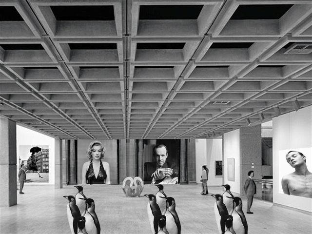
I have just finished doing an assignment on digital imaging where I had to produce a photomontage with a ‘message’. 

The instructions were to create an image which would make a strong visual statement about an issue, for example a political or social issue. This was difficult for me, not because I don’t feel strongly about a lot of things (because I do), but because it’s really hard to visualize some concepts, especially when you’re a bit hazy about your message.

The other criteria was that we could only use the photographs of certain (famous) photographers, so finding suitable source photos entailed hours of trawling the internet in a search for images which would inspire me. When I tried to rope in some friends and relatives to help me with my assignment, they all seemed to think that it would be a much easier task if I just knew what it was that I wanted to say. As a person who advocates for people to know what it is that they are trying to say before they start writing or creating presentations it struck me as hilariously funny that I had clearly failed to take my own advice. There was no way that I could find images that suited my theme when I didn’t have a clear idea of what it was I was trying to say.

I tried to get away with making some vague statements about the way the privileged classes monopolise culture, but it was hard to disguise the fact that I was just plain confused. I also tried to suggest that the finished image would express my idea better than any words ever could. Does an artist need to be able articulate the ideas behind their art? Shouldn’t the work speak for itself? Another ploy was to suggest that the viewer should be able to ‘read’ the image in any way they chose. Clearly, I was desperate and the due date was looming ever closer.

In the end I came up with the image below. It’s called ‘A visit to the gallery’.

What, if anything, does it mean to you? I would love to know if it says anything at all, or if you also struggle with pinning down your ideas?

Basic Principles USING IMAGES

Many people like to include images in their presentations but struggle with choosing appropriate pictures. You need to think carefully about the message you are trying to convey to your audience and choose images that are interesting but not too clichéd.  I once made a presentation about productivity and included a picture of some rabbits. This went down well with most of the audience, but a couple of people looked slightly confused.

There are a few basic principles about using images I’d like to share with you:

  1. Always use high quality images – this means no cheesy clip art.
  2. Use relevant visuals and try to avoid decorating your slides. This isn’t a definite no-no, as sometimes a few pictures can provide a bit of interest and break up the text, but it’s better if you can use images that reinforce your content.
  3. Don’t squeeze or stretch your images. If you need to re-size your images, always hold down the SHIFT key and adjust the size from the corners. This will ensure that the height and width ratios are maintained.
  4. Don’t steal images from the web. You should use licensed or free high quality images. There are lots of places to get these at a reasonable cost. Just search for ‘free photos’ or check out some photo libraries such as Shutterstock http://www.shutterstock.com/ Alternatively, you can shoot your own images on a good digital camera. I’ll  talk more about this in future posts.

Do you have any other tips for using images in presentations?

I’d love to hear from you.