Fields of gold

I’ve recently been on a little road trip into the Australian countryside. It seems that despite droughts, flooding rains and the odd election, the country is still very beautiful. We saw plenty of green rolling hills, sheep, cattle and quite a few alpacas.

One thing I noticed on my travels were the fields of canola, which I think is a relatively recent crop in Australia. This prompted me to take a few photos which I thought I’d share. What’s interesting is that I took these shots without wearing my glasses (too lazy to take them out of my bag) so I couldn’t really see what I was doing. Fortunately, they came out quite well thanks to employing the rule of thirds. This rule is well known to most photographers, and is the first thing you learn if you study photography or design. Basically, it means that you divide the page into thirds and place your horizons or focal points on one of the lines of the grid, rather than plonking things in the middle of the screen.

Slide1

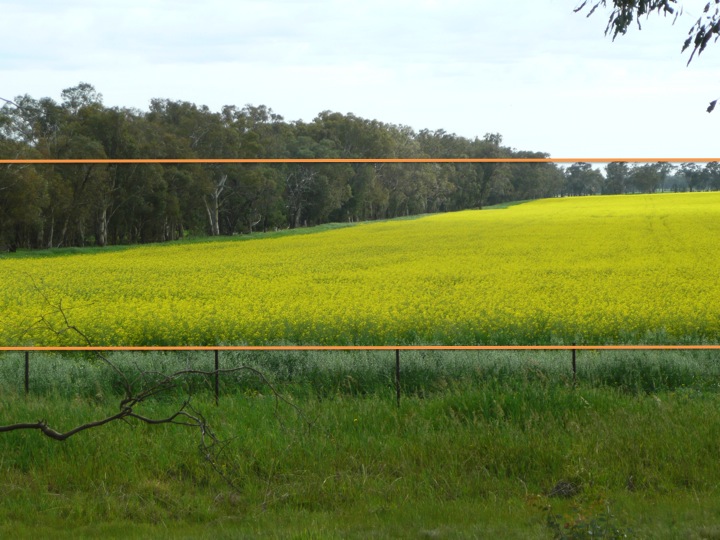
Here is an excellent explanation from Darren Rowse from the Digital Photography School in case you are unfamiliar with the concept.

It a kind of foolproof method for taking a decent shot, even when you can’t see that well what you are doing!

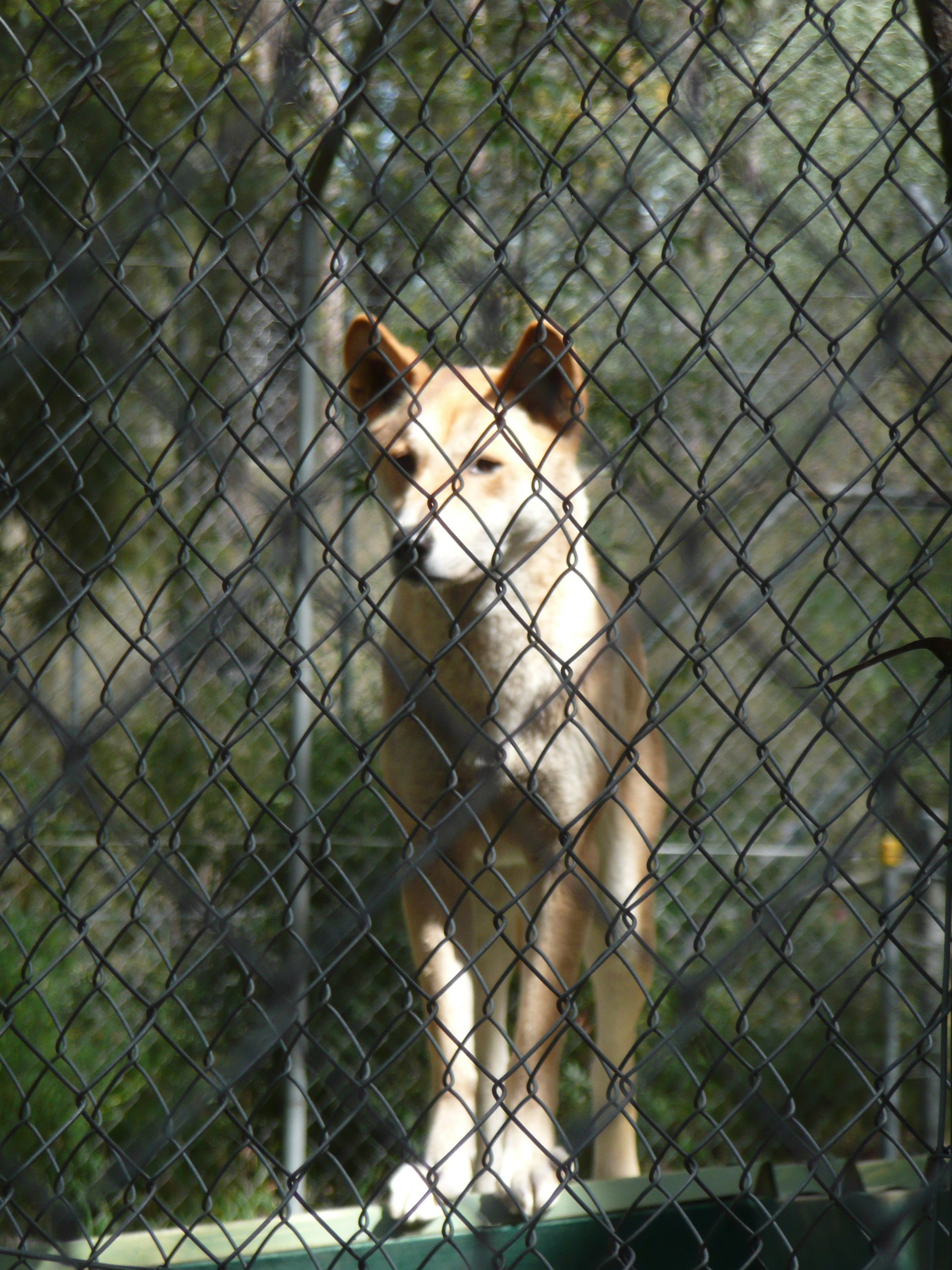
The shots below were taken at a dingo sanctuary in Bargo, NSW. The dingoes were in beautiful condition and seemed quite friendly, although we were not allowed to get too close to them. To be honest, I think my husband took the first photo, but he has a natural eye for composition.

P1010907

P1010903It was a wonderful opportunity to have some time away from work, relax and recharge. I highly recommend taking a break away from your normal routine if you get a chance and don’t forget to take your camera.

Arguing for simplicity

I experienced something of a failure this week. I was in a meeting trying to argue the case for making things simple and I failed. It wasn’t that the other people in the meeting didn’t understand the value of simplicity, it was just that the needs of the organisation won out over simple common sense. Those needs revolved around the need to protect the organisation from claims that we had not provided enough detailed and accurate information to the public. In other words it was a ‘butt covering’ exercise. We were more concerned about our legal position than we were about being clear and helpful. My argument that we had a moral obligation to provide the community with clear information fell on deaf ears. It seems that it is better for us to be obtuse than helpful, and it struck me that this was probably a common problem in a range of industries.

I imagine that the disclaimers we need to sign before undergoing surgery are the result of litigation. We need to sign a form saying that we know about every single complication that might occur and that we are willing to waiver our rights to compensation if those things actually happen. This is not about informing the patient, but about protecting the hospital or the doctor. It’s the same at my workplace, even though I don’t work in a medical environment. We are heavily focussed on ourselves, rather than on our clients.

It’s sad though, because it means that in cases where it’s not a matter of life or death, we still focus on protecting our interests rather than helping the community to understand what the issues are so that they can protect themselves. This led me to thinking about how we could argue the case for simplicity, and whether this could lead us to being in a better position legally, simply because we had provided really clear information to the public.

On reflection, here are a few things I wish I had said…

  1. People are less likely to engage in litigious behaviour if they feel that they have been well informed. If you write convoluted product disclosure statements (or terms and conditions) that people don’t understand they are inclined to be annoyed and angry. (I don’t have any evidence for this, but it just makes sense to me).
  2. If you are clear, people are less like to misinterpret the information and are therefore less likely to have problems.  (This will protect your organisation).
  3. People will know appreciate that you are making an effort to be clear and will feel more kindly towards you. (There is quite a lot of evidence to suggest that people are much more likely to engage in litigious behaviour if they feel that you don’t care).

In essence, the more you show that you care about your audience (by being clear and simple) the less likely you are to face problems. I wish I had said that…

What do you think?

Using plain English

I have lots of conversations with people at work about using plain English. It seems as though everyone thinks it’s a good idea, but people are less sure how to go about it, and even more importantly, how to get other people to use plain English instead of ‘government speak’. I work in a government organisation, so we see plenty of examples of long wordy documents filled with jargon and buzzwords.

It’s worthwhile thinking about why people don’t use plain English. Apart from people wanting to hide their true purpose, many people think that they need to write in a stuffy convoluted way in order to sound ‘professional’. This is far from true. Being professional is about being clear and writing clearly can be hard work.

As Woody Guthrie said… “Any fool can make something complicated. It takes a genius to make something simple.”

So next time you start writing something, think about how you make yourself as clear as possible. If you’re writing an important document or email, get someone else to read it before you send it. Be open to feedback about how you can improve your writing and practice as much as you can.

Enhanced by Zemanta

What does your workspace say about you?

Continuing with my theme of organising things, I thought I’d share this post on beautiful workspaces from one of my favourite graphic design blogs called Onextrapixel. It features some of the workspaces of famous designers. For example, this is the desk of New York designer Joel Speasmaker.

Joel Speasmaker


Compare this with my workspace below. It may not be quite as beautiful as Joel’s desk, but it’s certainly functional. I think that if you spend most of the day sitting down at work, the last thing you need to do is come home and sit down some more, so I often write standing up. And when I get stuck for ideas, I just do a bit of ironing.

My workspace
An ironing board makes a great desk

Where do you do your best work? At home, at the park, in a cafe? Feel free to share.

Enhanced by Zemanta

Things organised neatly

In my last post I talked about the fact that people like to see things arranged in an orderly fashion, so I thought that I would share this fun site with you.

Things organized neatly is a Tumbler site where people share their favourite images of (you’ve guessed it), various objects arranged in an orderly fashion.

Even for a not very tidy person like myself, this site has some inspiring, entertaining and oddly appealing images.

Here’s a sample…

A submission from Finland
Things organised neatly


Enhanced by Zemanta

How to simplify a complex topic

“There is a profound and enduring beauty in simplicity, in clarity, in efficiency. True simplicity is derived from so much more than just the absence of clutter and ornamentation – it’s about bringing order to complexity.”  Jonathan Ive – lead designer at Apple.

Regular readers of this blog will know that I agree with this statement wholeheartedly; simplicity is so much more than just removing clutter (although it’s often a good place to start). When I’m asked to review a presentation I often find that what bothers me most is when things “just don’t make sense”.  Sometimes this is because there are too many words, other times it’s because something is missing, for example the link between two related items isn’t clear. Mostly, it’s because the ideas aren’t structured in a logical way.

It’s much easier than you think to bring order to your content, and the simple solution is to sort your information into categories. If you think about it, bringing order to a complex topic is just the same as tidying up a messy clothes drawer.

This is how you do it:

  1. Get everything out of the drawer and spread it on the bed.
  2. Throw out the things that are old, or worn out, or no longer fit, or you just don’t need any more.
  3. Arrange what’s left into categories: track pants, tee shirts, socks and undies.
  4. Put them in neat piles and return them to the drawer.
  5. Congratulate yourself on being a well-organised person. 

It’s exactly the same with a presentation or a document.

Gather all your information together and look at what you can discard and what’s irrelevant. Just because  a piece of information is interesting doesn’t mean it’s useful. Once you’ve got all your content honed down and sorted into related themes, you just need to arrange this in a way that’s logical and makes sense.

Human beings love order and will attempt to make sense of unrelated items; our brains are wired to look for patterns even when they don’t exist. By arranging your content in themes, you provide the audience with a sense of order that they will really appreciate at an unconscious level.

So next time you are faced with a complex presentation or a long report, start by sorting, not by writing. You will feel less overwhelmed by the task and your audience will appreciate the results.


Enhanced by Zemanta

Busy slides are rarely memorable

If you want people to understand and remember your message you should use fewer elements. Elements includes text, images, meaningless clip art and logos. When you remove unnecessary elements from a slide, this is known as removing noise. Too many things on your slides (including too much text) can be thought of as white noise, interfering with the clarity of your message.

I appreciate that not every message can be reduced to a few simple words and an image. Some concepts are indeed quite complex and require detailed explanations, but this doesn’t mean that you need to clutter up your slides and reduce their effectiveness. You need to work twice as hard to figure out what it is you are trying to say and how you can express this simply.

One way to do this is to build your slides instead of presenting the complete idea all in one slide. You can do this using the animation tools, or if this scares you, just use what I call ‘pretend animation’. This is where you duplicate your slide and add one element. Say, for example you want to explain the relationship between three chemicals, all of which have their own unique properties. If you put all three chemicals on the slide and speak about them one by one, your audience will be jumping ahead and may feel overwhelmed, especially when you get to the part where you explain how they interact with one another. So start with just the first chemical on the slide and then add the second element to the next slide. Imagine how you would explain the concept if you were drawing it on a whiteboard and just do the same thing in your slides.

Introducing and explaining each concept with a slide build is a great way to get your message across without confusing your audience.

Enhanced by Zemanta

Simple versus simplistic

The other day I was surprised to hear a radio journalist use the word simplistic (meaning childish or oversimplified), when they meant simple (straightforward and easy to understand). It made me wonder if other people are confused about these two words and whether this results in simplicity having a bad name?

I have a sign on my desk that says SIMPLICITY IS THE ULTIMATE SOPHISTICATION (courtesy of Leonado da Vinci) and it serves as a reminder to me as well as people around me. I am constantly exhorting people to keep things simple, but I’m not talking about reducing ideas or concepts to the point where they become meaningless. Quite the contrary, reducing the complexity of information should increase the impact of your message and make it stronger, not weaker. Simplicity is about focus, order and clarity. It’s about making it easier for people to understand what you are saying, so that it will be memorable.

Do you face this challenge at your workplace? Do you have any suggestions about how to encourage people to make things simple, rather than more complicated?

Related articles

Enhanced by Zemanta

How to write a sentence

I’ve just been reading a fantastic book by Stanley Fish called How to write a sentence and how to read one. At the start of the book he describes the way words ‘slide into their pre-ordained slots’ in a well constructed sentence. I think this is an accurate description of the writing process. I’m sure that you’ve experienced writing a sentence, hitting the delete button and re-writing the sentence repeatedly until it feels just right. Not only do you need to hunt for the perfect word, you need to arrange the words in the perfect order and this is often a matter of trial and error.

Good writing is not just about choosing the right words, the relationship between the words also matters. This is called syntax. Where grammar is concerned with rules, syntax is about how words and phrases are arranged in a well formed sentenced.

Striving for well formed sentences can be hard work, so where do you start?

First of all, you need to accept that you will need to edit your work. (As a case in point, that sentence started off as ‘first of all, you need to accept that you will probably need to write and re-write every sentence numerous times’).

Secondly, remove any fluffy parts of the sentences that don’t really add anything of value. For example, I originally started this post by talking about how much I like reading, but I deleted it because it was irrelevant. (Also, it’s quite obvious that I like reading or I wouldn’t talk about it quite so much!)

Thirdly, use active voice. This is much less complicated than it sounds. You just need to get the subject in your sentence (usually a person or thing) to do something, rather than having something done to them (that’s why its called passive voice).

Here’s an example…

Passive: The ball was thrown by Ben.

Active: Ben threw the ball.

And another one…

Passive: The activity needs to be completed by all staff in the organisation.

Active: Everyone needs to complete this activity.

Or even better: You need to complete this activity.

So there you have it, it’s as simple as one, two, three.

Wan’t to chime in with your opinion? Feel free!

Enhanced by Zemanta

What does it mean to be user-centred?

The term ‘user-centred design’ is most commonly used in relation to web design, but I think it’s a concept that could be applied to every presentation that you make, and every document that you write.

In everyday use, user-centred design is about meeting the needs of users. This means designing a website that is easy to navigate and where you can actually find what you are looking for. Similarly, a product that is designed with the user in mind will have the following features:

  • The buttons (or controls) will be in a sensible place and be the right size for your fingers to operate
  • The operating instructions will be clear and logical
  • The product will do what you expect it to do
  • It will make you feel satisfied (maybe even happy) when you use it

In his book ‘The Design of Everyday Things, Donald Norman makes the point that designers need to understand how people think before they can design products that people will find useful. This means taking the time to think about their view of the world and their mental models of how things work.

Reports and presentations are no different.

They are often written from the point of view of the writer and are not really intended for the audience or the reader. Far too often, no context is provided, or alternatively a whole lot of irrelevant information is provided. The worst offenders are people who include their organisational charts in presentations.

English: Organisational chart produced by the ...
English: Organisational chart produced by the Office of the High Commissioner for Human Rights, to describe the functioning of the United Nations system of human rights bodies. A form of public information material designed primarily to inform the public about United Nations activities (Photo credit: Wikipedia)

An organisational chart is rarely of interest to your audience, unless the people in the audience actually appear on the chart. For external audiences, please feel free to skip the org chart, in fact, feel free to leave out any information that is not actually of interest to your audience.

When you are writing or developing a document that is meant to be informative, have a big think about what would actually be of interest to your audience and include that. If you feel you must tell people about how your organisation works, make sure that you tell them why this might impact on them. For example, if you have a customer service officer in every office across the state, this could enable you to have a good understanding of local issues that might affect your customers.

Make sure your information is clear and that your points flow logically from one to another. I read a lot of reports which are okay as drafts, but the content really needs editing and re-arranging. I see a lot of presentations where the author has clearly had an information dump, straight from their brain into the slides. It would be much better to sit down with a piece of paper and work out what it is that your audience might want to know and start with that. People are generally interested in anything that impacts on their wealth, health and happiness, so that would be a good place to start.

If you design your information with the user in mind, you will have a satisfied and happy audience.

Try it and let me know how it works out. I’d love to hear from you.


Enhanced by Zemanta