The elements of good design

The elements of good design

Photo by Sarah Dorweiler, Evano Community (link: https://evano.community)

We all like to create flyers, documents and presentations that are easy to understand and don’t confuse people. Luckily, there are some simple ways to achieve this. The main elements of good information design are:

  1. Clear and appropriate typography (you need to be able to read it easily and the font needs to match the message).
  2. Lots of white space (it doesn’t need to be white, it’s sometimes called negative space).
  3. A clear message (this is the hardest element as it requires you to actually think about what your key message is).

There are lots of other things that contribute to good design, including colour, but I think these are the most important.

Clear typography

This one is fairly self-evident and doesn’t require a lot of explanation, but it really surprises me how often people choose totally inappropriate fonts for their documents. Typefaces have their own personality and should be chosen with care. If you are looking for something whimsical or handwritten by all means use Bradley handwritten, but don’t even think about using this for a board report.

Lots of white space

A long email or report is more consumable by using white space to break up your text. Use spaces and headers to avoid large clumps of text and people will be more likely to read to the end. I recommend using this technique in emails as well as other documents. Using white space makes people feel less overwhelmed and more able to read the important parts of your message.

A clear message

This is the hard one. Sometimes we aren’t at all sure about what our key message is, and as a result it can get lost in a forest of words. We can beat around the bush and confuse people by not stating the obvious. I strongly recommend writing your key message out in a nice concise sentence and actually including it in your document somewhere, preferably near the beginning.

If you are starting from scratch with a document or even a simple email message, you should put your key idea at the top. If you want someone to respond to your email, why not tell them at the beginning that you expect a response, instead of at the end?

I know these ideas don’t sound very hard or radical, but you would be surprised how much difference using these simple principles will make to the information products you create.

Instructions for life


Like many people, I am a bit of a sucker for reading ‘Instructions for life’. You know the kind of thing I am talking about. They usually include things like being kind to yourself, trying new things and being kind to others. The other day I read a list which included having some lemony water every morning before breakfast. I’m not sure exactly what that does to your body, but I’m guessing it wakes up your mouth.


Instructions are very appealing. Just being called ‘instructions’ gives them a level of importance and authority. They are much more impressive than mere suggestions . The underlying message is that you just need to do exactly as you are told and all will be well.


So I was quite puzzled by the instructions printed on a new garment I purchased today, which read “Think climate cold wash and line dry”.  I misinterpreted this to mean that in a cold climate, one should wash and line dry the item, when of course it was actually an instruction to use cold water and a washing line instead of using hot water and a dryer.


I know that not many people would have misread this instruction, but it did make me laugh when I realised my mistake. I also know that a simple hyphen would probably have helped.


Enhanced by Zemanta

What skills does an information designer need?

All of the people in my family are quite good at criticising other people, and that includes me.

It’s not our intention to be mean, we are just really good at noticing things. We’re especially good at pointing out spelling errors and the misuse of words.

The downside of this is that my comments can sound a bit harsh, especially when I am marking assignments or reviewing the design of a website which someone has been lovingly creating.

This happened to me at work last week. I was so busy giving the person good advice (to be fair, they did ask me for my honest feedback)that I forgot to be sensitive to the fact that few of us can really tolerate criticism unless it is delivered with gentleness.

I’m often asked to review or comment on other people’s work and I try to remember that my job is to help people improve their work, rather than leaving them feeling like it has been chopped to pieces. But sometimes I fail and I need to work on this.

So while designers need to know about typography, colours, fonts, visual hierarchy and plain English, they also need to be good communicators and that’s a skill that requires endless practice.

Enhanced by Zemanta

What is information design?

I’ve recently discovered that nearly everything I’m interested in can be captured under the title of ‘INFORMATION DESIGN’. Apparently this is now recognised as a field of knowledge in its own right.

Why is this exciting?

It’s a bit hard to explain. It’s the same feeling you get when you have a mystery ailment – an odd collection of symptoms that seem to have no connection – and you discover that this is actually has a name, for example, arachibutyrophobia (the fear of peanut butter sticking to the roof of your mouth). It’s oddly comforting to find that something has a name. It makes it more legitimate somehow.

Three reasons to celebrate

I like the fact that information design is a recognised field for three reasons:

  1. I am interested in a lot of different areas and it pleases me that these are all connected and that I am not just finding it hard to concentrate.
  2. It means that there are a number of good books on the topic that I can read and learn from.
  3. It means that there are conferences and websites where people exchange ideas about this very interesting topic.

What do information designers do?

Information designers turn complicated concepts into things that are less confusing and easier to comprehend. They help people get things done. They design forms that people find easy to complete, they write clear instructions for new products, they help people find their way around shopping centres and universities.

They also design:

  • Websites
  • Maps
  • Reports
  • Slides
  • Signs
  • Packaging
  • Menus
  • Infographics

 Why does it matter?

If you are trying to find out how your new coffee machine works and the instructions aren’t very clear, it’s hardly a life threatening situation, but it can be annoying. If you are trying to find the entrance to the emergency centre at your local hospital and the signs aren’t clear, it could actually be a matter of life and death. What both scenarios have in common is that they leave us feeling confused and anxious and we often blame ourselves for our failure to understand. We shouldn’t do this because more often than not, the problem is that the information itself is poorly designed.

People come first

Information design matters because it puts the focus on the people who are going to use the information, not on the information itself.

I think it’s a fascinating field and over the next few months I’m planning to learn as much as I can and extend my skills.

I hope you will share my journey.


Enhanced by Zemanta

New beginnings

I love New Year. It’s  a great time to reflect on what you’ve achieved during the year and think about what you’d like to do next.

When I look back at the post I wrote this time last year, I can see that I was pretty focussed on being more focussed. My aim for the year was to try to be a bit less distracted and try to concentrate on developing a skill-set that would be:

  • Useful in my work
  • Useful to the community
  • Intellectually stimulating (I’m easily bored)
  • Valuable (i.e. marketable)

I have to admit that it has taken me the whole year to think through exactly where I’m headed, but now that I’ve done that I feel really happy.

I realise that this sounds a little bit self-important, and that’s not my intention. What I am trying to say is that sometimes it just takes time for things to become clear and once they do, it all seems very obvious. You can spend a lot of time worrying about things that will actually just work themselves out, if you give them a bit of time and space.

This is not the same as sticking your head in the sand.

I don’t mean that you shouldn’t make plans for the future.

It is important that you have a good idea of what you want out of life and what skills you need to develop so that you can contribute something meaningful to the world. If you don’t have a clear idea of what you value and what you enjoy doing, you will be hard pressed to know what you should be doing with your life, but it’s equally important to understand that you can’t control everything.

You don’t need to be extraordinary

Lest you think I’m talking about something big and grand here, let me assure you that contributing something meaningful can be as simple as making yourself available for a friend in need. Listening is a valuable skill and much in demand.

So what are your plans for 2014?

I realise I haven’t actually said what I’ll be focussing my energies on this year, you’ll need to wait for the next post for more about that!

In the meantime, what do you have planned?

Big and bold? Small, but meaningful?

What does your new beginning look like?

What have you been up to?

A couple of people have asked me why I haven’t written any posts lately and my immediate response is that I’ve been busy. Too busy to blog? Really?

Well, yes and no. While I have been very busy at work lately (end of year rush and all that), its also true that I’ve had a few moments of self doubt recently, as many of us do. Sometimes it strikes me that blogging is a very peculiar way to spend one’s time… After all, there are so many good books and articles to read, do I really need to contribute to your inbox which is probably already groaning under that weight of all those emails?

The answer is yes I do!

Why I write…

  1. In my last post I wrote about some of the reasons that people like to share their ideas, and in my case it’s because I think that interesting ideas need room to breathe and expand. A good idea can make you think differently about how you see the world, it can change the way to perceive yourself and it can help you grow. Writing helps me clarify my ideas and work through ideas.
  2. Blogging is also a great way to communicate with people all around the world. Some of my favourite writers live diverse (but ordinary) lives in all parts of the world. I would never have stumbled across them except through blogging. They bring light and shade into my world and make it richer and less narrow.
  3. Blogging is a great way to encourage people to learn something new and have a go. I truly believe that you should never stop learning and having this platform is a perfect vehicle for providing advice and encouragement to others. Its not that what I have to say is especially profound or special, its just a nice way to keep in touch with a bunch of random, but wonderful people. That’s you folks!

So if you are looking back on your year, I hope you give yourself credit for all the things you’ve achieved. They don’t need to be grand. It’s the small challenges that make up a life.

Have a happy Christmas and I’ll be back next year with some new ideas about simple design, improving your writing and learning new skills.

If you have any thoughts about topics that would interest you, I would love to hear from you, or you could just say hello and tell me how your year has been.


Enhanced by Zemanta

Why do people share?

Last night I spoke at a community forum about the impact of digital technology on society. What a lovely bunch of interesting people were there. They asked such good questions.

A couple of people asked me why I started this blog and although I have written about this previously, I thought it might be interesting to look at the reasons why so many people love blogging. On the WordPress platform alone, there are 72 million blogs with over 400 million readers, so it’s quite a popular pastime.

Four reasons why people blog

Many people blog for validation. They want the world to know they exist and they want to get feedback from others to confirm that their ideas and opinions are valuable. People who write blogs for this reason can be a bit obsessed with the number of subscribers that they have. The more the better.  I don’t fit into this category, although I am always thrilled to bits when someone new signs up. I may not have a huge number of subscribers, but I am convinced you are all intelligent and interesting, and that matters more to me than sheer numbers.

Then there are the social bloggers. These are people, for example young mums, who might be find being at home with a baby a bit isolating. I saw a lovely ‘mummy blog’ the other day where women were sharing ideas about what to cook for dinner that would be easy, nutritious and that the kids would actually eat. This type of blog serves an important social function and can help get people make contact with others who might be in similar situations.

Thirdly, there are people who blog to promote themselves or their product. Sometimes they provide really good information and sometimes it’s just a thinly disguised sales pitch.

Other people blog because they love sharing information and ideas. This is the category I fit into. I think it comes from being a teacher – when I read something interesting, I often think ‘who can I share this with?’ and this blog gives me the perfect platform. Blogging also gives me the chance to clarify my thoughts and practise my writing, but most of all it gives me the opportunity to encourage other people to learn new skills and expand their horizons.

Should you start a blog?

It can be time consuming, but it’s fun and rewarding.  It’s also really easy, so if you think you have something to say you should give it a try!


Enhanced by Zemanta

What’s on your bucket list?

I have been invited to speak at a local forum about the impact of technology on society. I am very excited about this because speaking at a conference has been on my bucket list for quite some time. I was asked to speak at a social media conference earlier this year and I demurred, not because I was afraid (alright, I was a little bit afraid) but mainly because I didn’t feel that my organisation had evolved to the point where I would be able to talk about our success.

The invitation to speak at a local forum came about through one of my dear friends who is very active in the community and to be honest, I was thrilled to be asked to speak. When we discussed what I would talk about, I was surprised to find that she expected me to talk about the negative effects of technology on social relationships, literacy and the mental health. I am only too aware that being over-connected to a screen can interrupt relationships and lead to social isolation, but equally, technology can let you connect with your children, your grandchildren and people who share your interests. It can be a wonderful or terrible thing, depending how you approach it.

So I’m about to do something a little bit scary and I wondered what was on your bucket list? Is there something you would really like to do and just need a little push? It would be lovely if you wanted to share your thoughts.

Enhanced by Zemanta

More confusion

Apparently I confused more than one reader when the sign I discussed in my last post didn’t actually show up in the message. This is apparently a function of the blog software which I use  so I have learnt something from that exercise.

Here is the photo of the speeding sign for those of you who missed it.

Must we really drive too fast?

Here’s another sign I found very amusing.

Screen shot 2013-09-22 at 8.37.44 PMHave a great week!


Enhanced by Zemanta

Confusing signs

On our recent trip we were  amused by this road sign exhorting us to drive as quickly as we could.

You sometimes wonder who on earth writes these signs and whether or not anyone actually reads them before they go on display. In this instance I think that most people would work out what the real message was, but sometimes poor signs can have disastrous consequences.

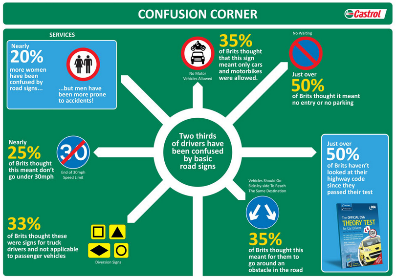
This infographic from the Guardian shows that many people in Britain are more than a little confused about what the various road safety signs actually mean, and I think this would be the case in most countries.

Confusion corner

What makes a good sign?

As with most things, typography is important. The font used in all British road signs was developed specifically for that purpose and is designed to be legible at a distance. Not only does the type have to be very clear (no serifs or curly bits required thank you), but the spacing between the letters needs to be exactly right. Adjusting the spacing between the letters is called kerning.

Diagrams need to be as unambiguous as possible. If you are designing a sign or instructions of any kind you need to make sure that you test them out on as many people as possible to make sure that they are not misinterpreted. In your focus group you should include older and younger people and people from as wide a range of cultural backgrounds as possible.

Your sign needs to contain the minimum amount of information required to make it meaningful and the colours need to be chosen to allow for conditions such as colour-blindness.

I know that not all of you spend your days designing signage, but the same rules apply if you are making instructions for how to get to your house, or how to use the photocopying machine at work. These are not necessarily matters of life and death but people appreciate clarity and will be grateful if you make the effort.

Here is my favourite example of an hilarious sign…

Do not read

Enhanced by Zemanta